Recent Work
Revealer AI
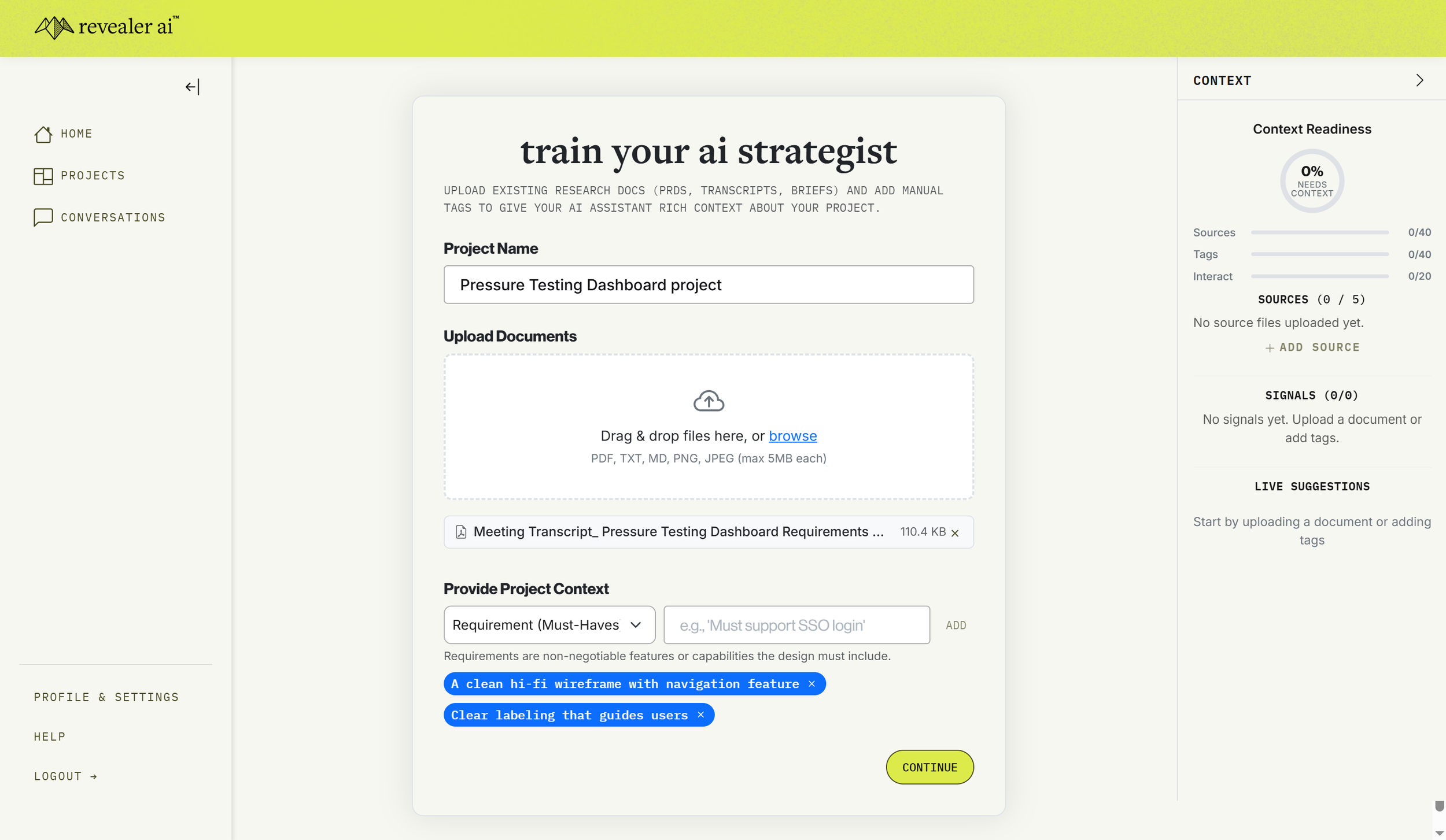
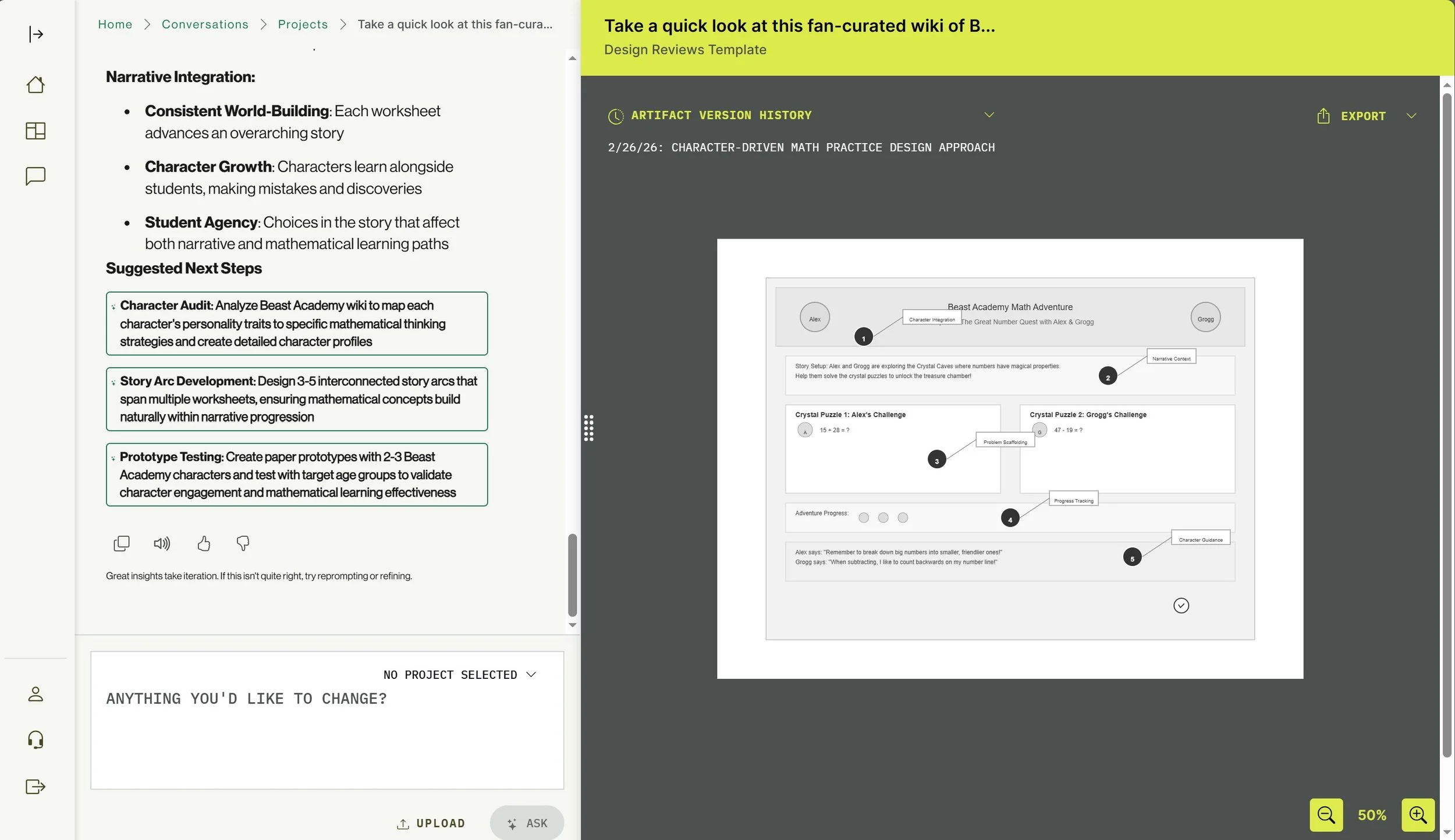
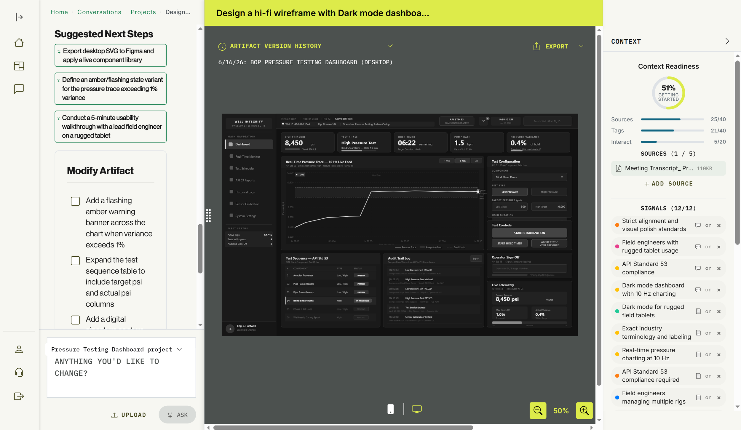
As the Lead UX Designer for Revealer AI, I bridged the gap between raw generative power and professional design workflows by transforming a high-level AI concept into a structured, artifact-driven platform. My work centered on solving "blank-page syndrome" through a Template-First UI that replaced open-ended prompting with clear, high-value entry points like wireframing and workshop facilitation.
I designed a cohesive ecosystem that moved beyond static generation, introducing a persistent "Modify" engine for iterative refinement and a logic-aware narrative integration system for complex use cases like educational gaming. From establishing a "professional co-creator" brand identity to optimizing high-fidelity mobile translations for enterprise stakeholders, I ensured the platform felt like an intuitive extension of a designer’s toolkit rather than a black-box generator.
Eventellect
Eventellect is a sports analytics pricing and inventory management platform for national sports leagues. I conducted several usability sessions with internal and external users of the product, and partnered with product and engineering to design features that pushed the boundaries of sports analytics. I also helped fine-tune the foundational AI model they were using, integrating data from UX discovery. Here are a few projects I led:

Walkthrough of a usability recording with a user


Analytics screen user-interview with annotations

Full UX research and design to explore partner needs and develop solutions


Oak Ridge National Laboratory
As a UX/UI Designer III for a national science lab, I worked with stakeholders across the organization to research, ideate, and design the information architecture and overall flow for geo-imaging products. I also worked on other projects for internal government customers like the Department of Veterans Affairs.
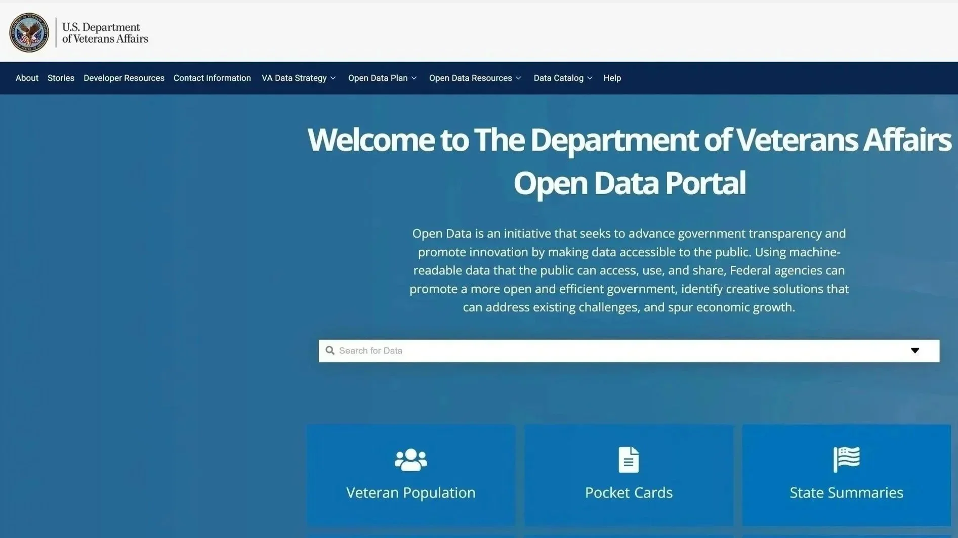
As a Senior UX Designer at Oak Ridge Natio nal Laboratory, I led the design of the VA Data Commons, a bridge between the Department of Veterans Affairs’ massive clinical datasets and the high-performance computing power of the DOE.
Screen 1: The Landing Page (The Gateway)
The Problem: VA data was historically siloed across disparate systems (MVP, EHR, Genomic enclaves). Researchers, policy analysts, and data scientists faced a "discovery wall"—they didn’t know what data existed or if it was relevant to their specific cohorts until months into the access request process.
The Solution: I designed a "Domain-First" Architecture. By categorizing 50+ terabytes of information into intuitive buckets (Genomics, Clinical, Surveys, and Phenotypes), I provided immediate visibility. The "Search-First" hero section allows users to query across all silos simultaneously, transforming a months-long investigation into a 5-second search.
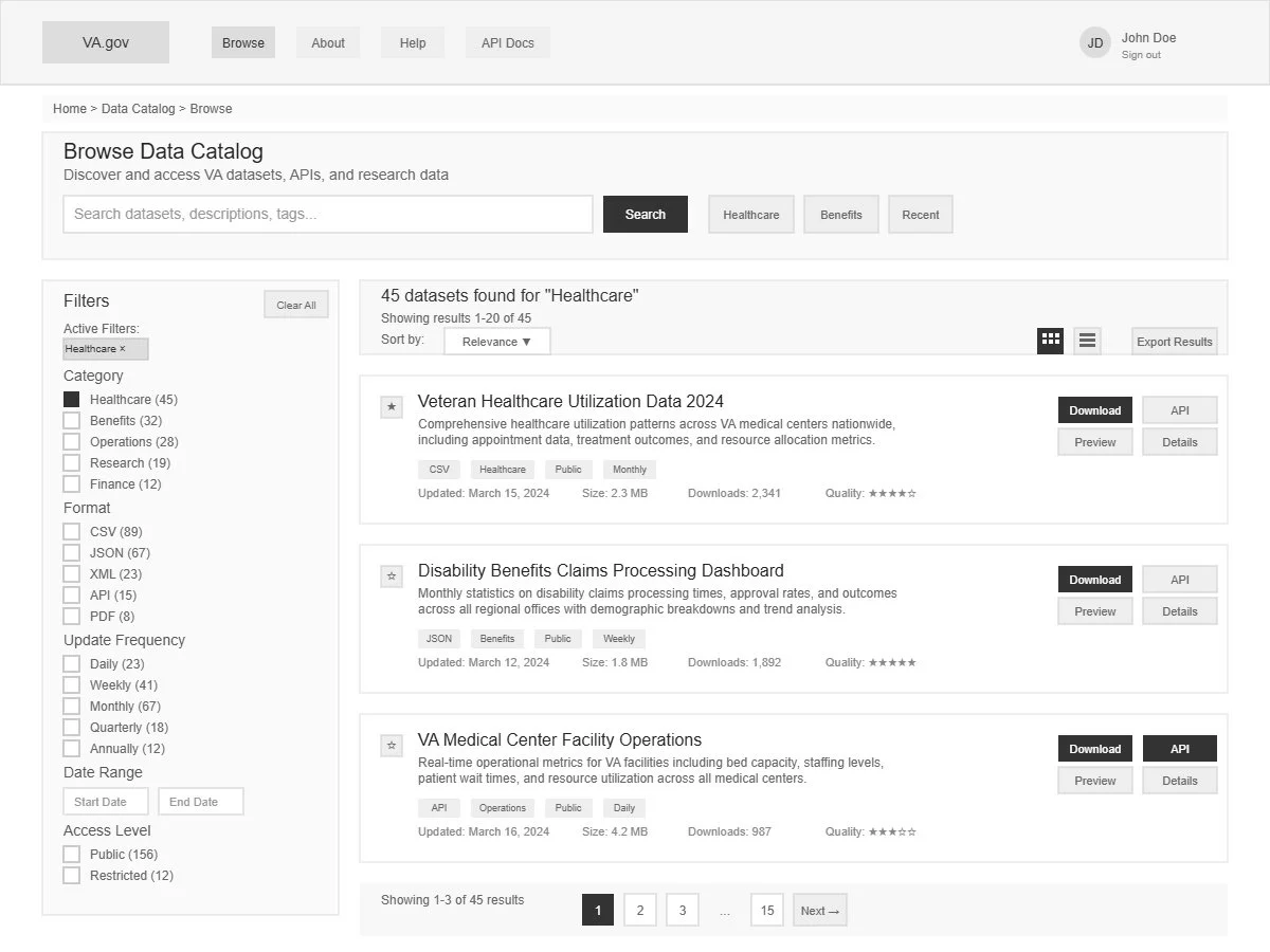
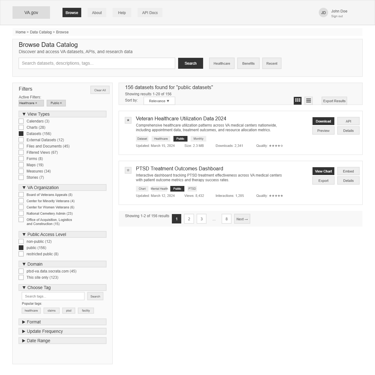
Screen 2: Portal Wireframes (The Logic)
The Problem: Navigating thousands of clinical datasets creates high cognitive load. Researchers need to find "Phenotypes"—computable definitions of diseases (e.g., specific ICD codes + lab results for "Type 2 Diabetes")—without getting lost in raw table metadata.
The Design Strategy:
Faceted Discovery: A robust left-hand filtering system to pivot by data source, update frequency, and access level.
High-Signal Hierarchy: Using a "Grab-and-Go" approach, I prioritized record counts, data dictionaries, and "Validated Phenotype" tags on the result cards.
Low Cognitive Load: I stripped away administrative noise, focusing purely on the attributes required for a researcher to determine if a dataset fits their study's inclusion/exclusion criteria.
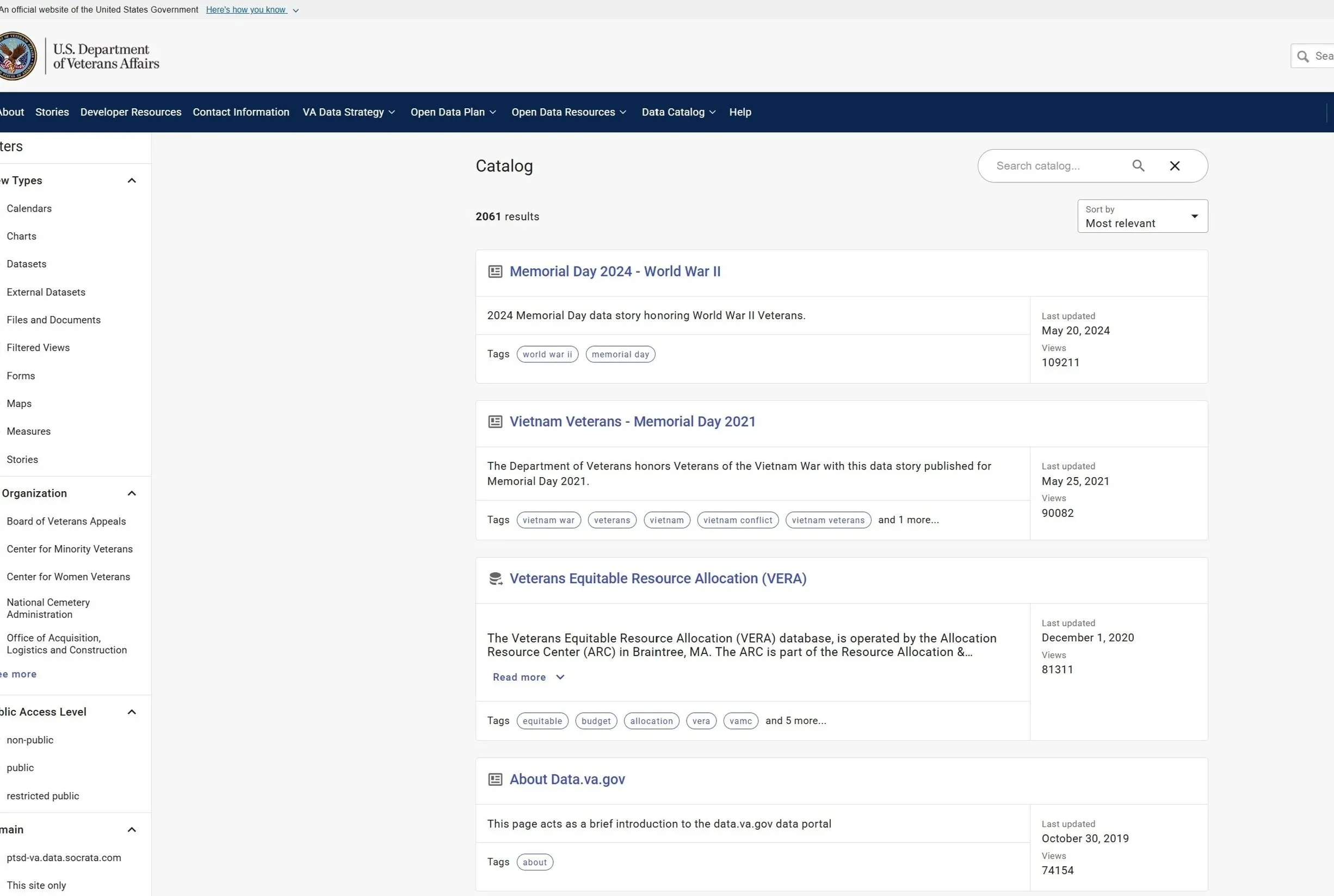
Screen 3: High-Fidelity Portal (The Delivery)
The Tech Stack: To support enterprise-grade security and massive data throughput, we utilized:
Frontend: React.js with a custom-themed USWDS (U.S. Web Design System) for 508 compliance.
Search Engine: Elasticsearch for sub-second indexing of complex clinical metadata.
Backend: Node.js microservices integrated with Globus for secure, high-speed file transfers to HPC clusters.
Identity: Keycloak for federated authentication across VA and DOE enclaves.
User Testing & Validation: We conducted Recursive Usability Testing with 12 VA clinical investigators. By observing their "Path to Insight," we identified that researchers prioritize "Sample Size" and "Data Freshness" above all else. I iterated the UI to surface these two metrics in bold, high-contrast badges, resulting in a 40% reduction in time-to-discovery during final validation sessions.
Securoute - A web app route management tool that allows users to filter by risk.

Securoute allows users to use risk avoidance when calculating a route.
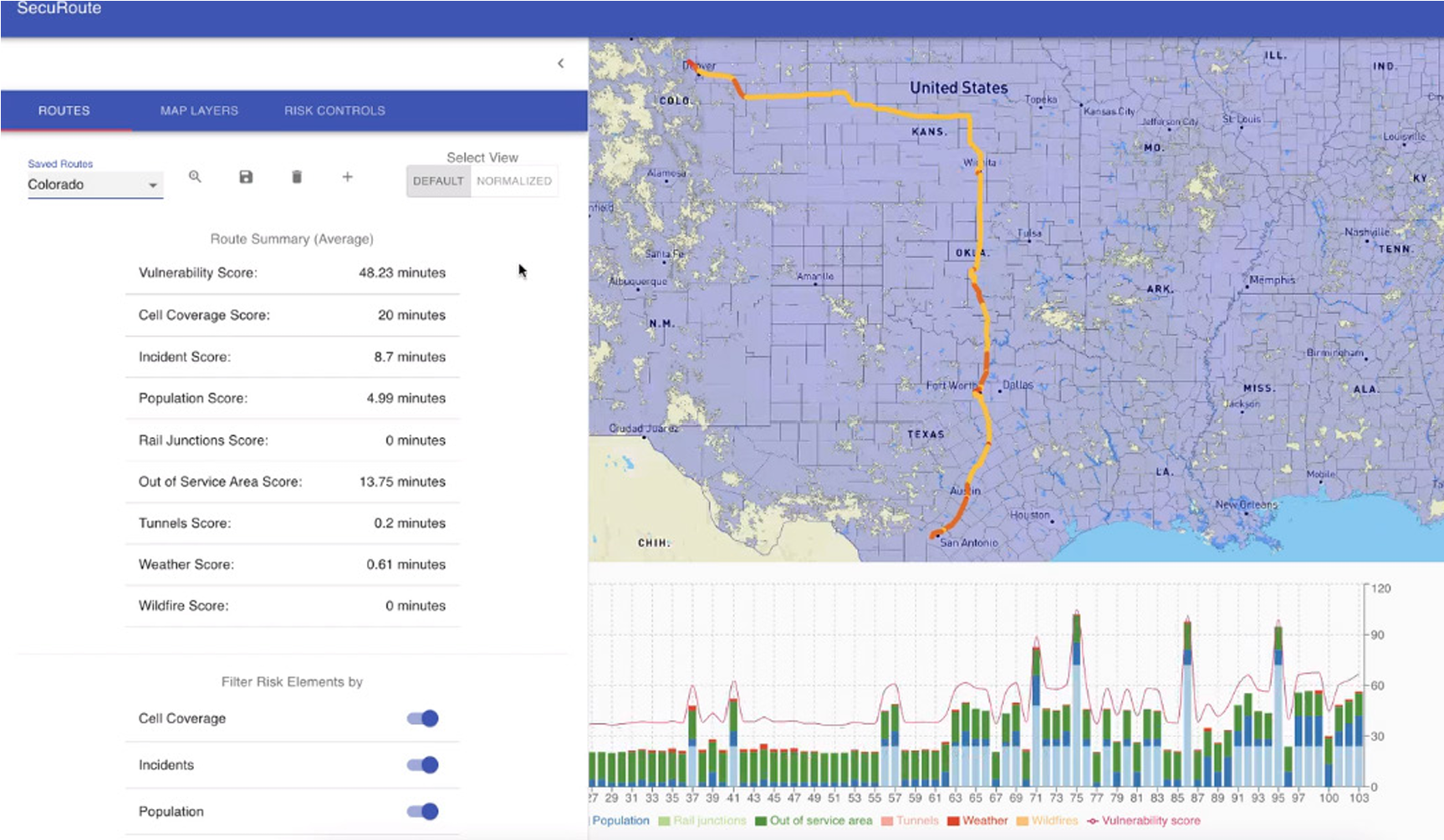
Early iOS mockup prioritizing visual hierarchy, usability, and explainability.

Woodforest National Bank
As a Sr. UX Designer for one of the largest banks in Texas, I worked in a quick-paced agile environment. I interacted daily with multiple business groups to gather requirements, attend grooming sessions, design mockups, prototypes, & wireframes for both customer and internal-facing users.
Teller Alert application wireframes

Teller Alert system for backstage users that need to flag customer accounts.
Gathered requirements from the D1 Teller business unit and translated documentation into backend teller alert system wireframes.

Customer View, Account View, Debit Card View.
I designed multiple wireframes for different types of actions. The wireframes included droplists, a text box, a method to distinguish alerts from notes, and buttons at the button.
Heuristic Analysis
As part of a heuristic analysis that focused on the online application flow for the bank, I analyzed and provided recommendations for several features that can improve the user experience. These recommendations were also validated with data from Google Analytics.

This heuristics report is a combination of UX heuristic recommendations and a comparison between current designs and wireframes that solve specific usability problems.

The contents page organizes the document neatly.

Recommendations on the left that include numbered directional arrows to current designs and mockups help support an argument for redesigning specific features, text, and interactions.

UX Research Artifacts
-

User Persona
I created this user persona to help me empathize with the client experience. I will later use this artifact to visualize a current-state user journey map.
-

Competitive Analysis
I conducted a competitive analysis to learn staffing competitors’ design patterns, placement of CTA’s along the user flow, how they describe the benefits of one product over another and comparing the mobile journey vs the desktop journey to identify usability issues.
-

Current-State User Journey Map
I visualized my idealized user going through the different phases and touchpoints, I immediately see areas of opportunity and friction points that require experience and service design.
-

Affinity Map
After reviewing interview transcripts from multiple users, a pattern began to emerge around usability issues. I grouped similar concerns together and created an affinity map.
-

Future-State User Persona
This future-state user persona represents an idealized user. the data used to create this persona came from the interview transcripts and the affinity map.
-
Journey Map
The user journey map brings to light what the persona does, thinks, and feels when trying to complete certain tasks. The friction across all of the touchpoints are entry points for improving the experience.